Winter Colour Palettes for your business
- Evelin Horváth
- Dec 1, 2025
- 3 min read

Seasonal colour palettes can help businesses bring fresh energy into their branding, whether for a full design update or a limited seasonal campaign. Thoughtful colour choices support visual consistency, strengthen emotional impact, and ensure your brand feels cohesive across platforms.
We curated three winter-inspired palettes to spark ideas and guide your design decisions this season.
But first, the "boring" part!! :)
Professional Design Guidelines to Keep in Mind
When applying any seasonal palette, remember a few fundamentals to keep your brand materials polished and accessible:
Always check contrast. Ensure text meets accessibility guidelines (WCAG AA for body text).
Prioritize readability. Dark text on light backgrounds is usually safest.
Stay consistent. Choose 1–2 dominant colours per design and let the rest support them.
Test for digital and print. Winter palettes often contain muted tones, always check CMYK conversions before printing.
1. Alpine Stillness

Soft Wool - Winter Sky - Pinot Noir - Cocoa
Inspired by snowy mountain roads, muted forests, and the contrast between winter light and deep shadows, Alpine Stillness is a calm yet grounded palette.
Mood: Serene · Minimal · Understated
Best for: Hospitality, wellness brands, consultancies, creative studios
Works beautifully on: Websites, hero sections, branded stationery
Palette Colours:
Design Tips:
Use Soft Wool as your primary background to keep designs breathable.
Apply Pinot Noir and Cocoa for headline typography or accents they add elegant depth.
Check contrast carefully when using Winter Sky behind text; pair it with dark text for readability.
Keep layouts simple to let the muted tones shine.
2. Fireside Holiday

Candle - Rosie Cheeks - Pine - Santa
Warm and nostalgic, this palette captures the glow of a crackling fire, cozy gatherings, and the classic colours of the holidays without feeling cliché.
Mood: Cozy · Warm · Friendly
Best for: Boutiques, handmade brands, cafés, lifestyle products, festive campaigns
Perfect for: Packaging, illustrations, holiday social media templates
Palette Colours:
Design Tips:
Use Candle as a soft base layer to keep designs readable and inviting.
Pine is perfect for legible headings or icons - balanced, grounded, and elegant.
Santa should be used sparingly; it’s a strong accent that draws immediate attention.
Always maintain contrast when combining Rosie Cheeks with warm off-whites.
And last, but not least, our favourite one. Maybe because it's so extra fancy still funky!
3. Festive Indulgence
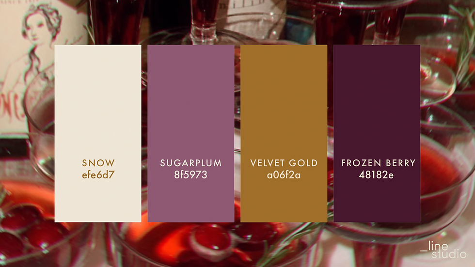
Snow - Sugarplum - Velvet Gold - Frozen Berry
This palette celebrates the richness of winter celebrations - deep berries, spiced gold, and sweet pastels. It’s bold, luxurious, and visually striking.
Mood: Glamorous · Festive · Bold Best for: Premium brands, bars, hospitality, editorial layouts, event promotions Ideal for: Highlight graphics, bold typographic layouts, high-contrast social posts
Palette Colours:
Design Tips:
Keep Snow as your main neutral to ensure clarity and balance.
Frozen Berry creates strong, dramatic backgrounds - pair with Snow for maximum contrast.
Velvet Gold works best as an accent to avoid overpowering the composition.
When using Sugarplum behind text, test the contrast to keep everything accessible and readable.
We really hope you enjoyed these palettes and that you can use them in your creative work: whether that’s designing for your business, crafting, illustrating or simply playing with colours for your own joy.
Winter is the perfect season to slow down, get inspired, and let beautiful tones guide your imagination.
With love and lots of colour,
Lilla & Evelin


Comments